
2022 - ongoing
Modular Fintech Dashboard for small and mdium growing businesses
MY ROLE
Product Design
UX & UI
Research
COMPANY
Tide
TOOLS
Figma
UserZoom
Looker
Jira
Confluence
SUMMARY
Growing medium-sized businesses need to have a good grasp on their finances — what is due, what is outstanding, what goes in, and what goes out. Also when and how much is due.
To cater to the needs of different business types, the information has to be laid out in an intuitive and easy-to-digest manner that gives users control of what is relevant to them.
This case study examines how this can be achieved by using rich data visualization techniques and modular layouts in a user-customizable financial dashboard.
DISCLAIMER
Project details and data pertaining to metrics have been omitted due to NDA provisions. This is an ongoing project.

Context
This is an ongoing work-in-progress project. It's currently on the stage after the basic user need a dashboard has been identified. As such, it aims to explore the fundamental building blocks of a dashboard -- widgets, data visualisation, scalable layout, modularity and interactivity. The next stage is to identify the actual user needs for specific sets of data that need to be displayed on the dashboard.
During interviews, owners of growth businesses told us that they needed a way to "track the pulse" of their ventures, including multiple accounts and -- in some cases -- teams of 10 to 20 people. They wanted to know what is due, what is outstanding, what goes in and what goes out. Also when and how much.
Growth businesses, which expand at significantly higher rates than most SMEs (being in the top 5%), also have to deal with the increasing complexity of day-to-day operations. Things like raising and keeping track of hundreds of invoices each month, managing the expense cards of your team members, and tracking revenue and expenses are of vital importance to this type of business.
Framing
Following the interviews and identifying the fundamental user need for a versatile and customizable dashboard, I wanted to understand the business side of things and how the broader team thinks. I also needed to know how a dashboard would fit in with the existing Tide experience and design system.
Since dashboards are complex — both functionally and structurally — I decided to deconstruct the notion and start with the fundamental building blocks of every dashboard - widgets.
I facilitated a workshop with the wider team to understand how stakeholders in different business areas think of widgets in terms of connectivity chains and how the broader design team sees them in the context of Tide's member experience and design system.
Workshop
During the workshop, we came up with a set of ground rules for widgets that we wanted to adhere to with regard to the overall concept and functionality of widgets. After all, widgets — and by extent dashboards — would become a branch of the existing design system.
Widget manifesto
1. Mobile-first
Widgets are designed from the ground-up for mobile
2. Insightful
Widgets provide users with dynamic information
3. Actionable
Widgets offer users one or more actions
4. Relevant
The information in the widgets is relevant to the user or flow
5. Simple
Widgets are to-the-point and focused
6. Connected
Widgets are an entry point to a part of the app/feature
Widgets as part of a design system
The current Tide design system does not include widgets. Obviously, being the building blocks of dashboards, widgets would have to fit in and largely conform to the existing design system, although some changes to the system itself are also not out of the question if it is to provide for the rich data visualization techniques that would be employed on dashboards.
With this in mind, I set out to explore various widget sizes and anatomies in order to come up with a hypothesis for user testing.
Basic widget anatomy
1. Container
Widget containers hold all widget elements. Their dimensions are determined by the size of the widget (S, M, L)
2. Header text
The header text describes the function of the widget or the product area that it leads to in up to 2 words
3. Body
The body can contain many different things related to data (e.g. charts, graphics, numbers)
4. Primary action (optional)
The primary action is displayed prominently under the body. It allows users to take important actions related to the information displayed in the widget.
5. Secondary action (optional)
The secondary action is displayed in the upper right-hand corner of the widget. It relates to the widget itself (e.g. filtering or otherwise controlling the content displayed in the widget).

Widget sizes

Widgets are available in three different sizes: Small, Medium, and Large. Small and Medium widgets have the same dimensions on mobile and desktop. They are stacked next to each other on desktop. Large widgets scale to the width of the content on desktop and are always stacked on top of each other.
The different sizes are essential for displaying content and data visualizations on various screen sizes. You don't want to use the smallest widget size for something very information-dense, and vice-versa.
Preliminary testing of the proposed anatomy with real use cases
Before the proper user testing, I needed to do some internal stress testing of the proposed anatomy. For this purpose, I decided to rely on some actual use cases that I'd identified and see if the anatomy could accommodate the cases at least on a rudimentary level.
This was a good exercise to do before going into user testing, as it helped us better understand how the seemingly uncomplicated anatomy could scale to accommodate for fairly complex data visualization.
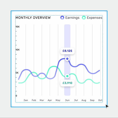
Many tests were done, two of which you can see here. They are for a Cashflow Insights widget and an Invoice Planner. Many more were done, each one undergoing a pros and cons analysis (that cannot be included in this case study).

User testing
Widgets are multifaceted components that provide dynamic information, interactivity, multiple touch targets, and can also lead as funnels to different parts of the app. That’s a lot of variables, which, combined with the various types of data and user scenarios that widgets can accommodate, leads to a lot of unknowns that need to be tested.
I wanted to test a number of widgets, covering a wide gamut of actions, data, and needs in order to establish how users interact with widgets, what their expectations are with regard to functions and clickable areas, and how they go about performing specific tasks with the help of widgets.
Widget types for testing
After identifying various different types of widgets, I picked the ones that best suited some of the most common use cases. These included charts (bar chart and stacked), a calendar, two variations of a list widget, and a customizable widget that lets users pick their own shortcuts.

Sample of widget types selected for testing
Questions to answer:
-
What do users interpret as tapable/clickable on a widget?
-
What are users’ expectations of different click/touch targets?
-
How much functionality is too much functionality for a single widget?
-
What types of tasks are appropriate for widgets?
-
How might widgets act as gateways to support the natural exploration of our product?

Some scnearios for user testing
DISCLAIMER
Testing has not been concluded yet and other areas of discovery and research, including the modular layout and user-facing customisation functions have been ommited from this case study
Scalability, responsiveness, interaction
Given the complexity of dashboards, the widgets, and overall layout needed to be built with scalability and responsiveness in mind.
Furthermore, the screen real estate of all supported platforms needed to be utilized in an efficient way - mobile, tablet, and desktop. That's why widgets have different views and interactions across the various platforms.
All of the previews below have been animated and prototyped on Figma (responsibly and responsively designed).

Invoice Planner (calendar) widget on Mobile and Desktop/Web
Example of a responsive chart widget built using auto layouts

Example of a long-press or swipe interaction